
.jpg)

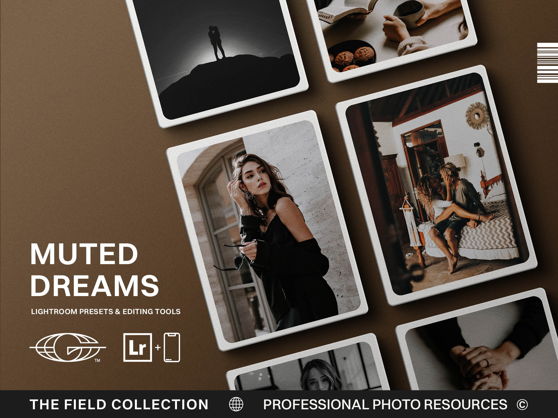
Best Moody and Cinematic Presets and LUTs for Visual Storytellers
The word cinematic has been used so much that it sometimes arrives already tired.
People put it on presets, LUTs, reels, YouTube thumbnails, coffee pours, grocery store parking lots, and footage of a man walking slowly past a fence as if the fate of a kingdom depends on his oat milk latte.
Still, the word survives because it points to something real.
A cinematic image has presence. It feels intentional. It has depth, structure, emotional weight, and a sense that the light is doing more than merely making the subject visible. A moody image can do the same when it uses shadow, contrast, and color to pull the viewer into the frame.
The problem is that moody and cinematic editing often gets reduced to making everything dark.
Moody does not mean underexposed.
Cinematic does not mean crushed shadows and teal highlights applied with the emotional restraint of a raccoon in a pantry.
The best moody and cinematic presets and LUTs help visual storytellers add depth without burying the life of the image.
Start With the Light, Not the Darkness
A strong moody edit begins with light.
That may sound backwards, but shadow only works when light gives it meaning. A dancer caught in a slice of window light. A bride standing near a dark hallway. A face half-lit by a sign on a city street. A truck at dusk with the last warmth of the sun holding the edge of the frame.
The light tells the viewer where to look.
The shadow creates the atmosphere around it.
If you simply darken everything, the image does not become moody. It becomes difficult to see. Hiding your subject in a closet would technically create mood, but it would not create a good photograph unless the closet has excellent narrative purpose, which most closets do not.
Good cinematic presets and LUTs should preserve the subject. They can deepen the environment, shape the shadows, and create a stronger sense of drama, but the viewer should still know where their attention belongs.
Look for tools that help separate subject from background, highlights from shadows, and warm tones from cool ones. If the preset or LUT makes the whole image heavy in the same way everywhere, it may be working against the story.
Mood needs contrast.
Use Shadow With Restraint
Shadow is one of the most powerful tools in visual storytelling.
It can create mystery, intimacy, tension, weight, and a sense of emotional distance. It can also ruin an image very quickly when used without restraint.
A tasteful moody edit does not crush every dark area until it becomes a black hole with artistic aspirations. It keeps enough information in the shadows for the viewer to feel depth. The blacks can be rich. The contrast can be strong. But the image should not feel like the editor panicked and decided detail was the enemy.
This is where presets and LUTs need to be carefully chosen.
Some moody tools are built for drama at any cost. They look exciting on a sample image but fall apart when applied to real work. Skin tones get muddy. Backgrounds disappear. Clothing loses texture. The image becomes less emotional because it becomes less readable.
Better moody presets and LUTs control shadow in layers. They protect the subject, hold enough detail, and deepen the scene in a way that supports the story.
A good edit invites the viewer into the darkness.
It does not lock the door behind them.
Look for Color Separation
Cinematic color often comes from separation.
Not necessarily wild colors, but enough difference between tones that the image feels shaped. Warm skin against cooler shadows. Golden highlights against deep blue evening light. Muted greens against warm earth. A soft red sign against a darker street. Color helps the viewer feel the emotional temperature of the scene.
This is one reason LUTs are so useful for video. Moving images need color to hold across time. A scene can feel disjointed if every shot has a different emotional palette. A cinematic LUT can create a shared color base so the viewer experiences the footage as one world.
Presets can do the same for photos.
The danger is over-separation. When the colors are pushed too far, the image starts feeling less like a story and more like a look. The viewer notices the grade before the moment. That is usually a sign that the edit is asking for too much attention.
The strongest cinematic color feels intentional but not desperate.
It supports the image without waving both arms and yelling, “Look, I watched movies!”
Choose tools that create depth through restrained color decisions. Warmth, coolness, contrast, and saturation should all serve the subject.
Match the Tool to the Medium
Presets and LUTs can both be cinematic, but they belong in different workflows.
Lightroom presets are built for photographs. They help shape still images through exposure, tone, color, contrast, grain, and other settings. LUTs are built for video. They remap color inside editing software to create a consistent look across footage.
If you are a photographer creating moody portraits, street work, landscapes, or cinematic stills, presets are the right tool. If you are a filmmaker, wedding videographer, YouTuber, or brand storyteller, LUTs belong in the workflow. If you create both photo and video, matching preset and LUT collections can help your work feel connected across platforms.
This matters because the audience experiences your visual brand as one body of work.
They may see a reel, a gallery, a YouTube thumbnail, a website hero image, and a product video in the same week. If each one looks like it came from a different visual universe, the brand feels less cohesive.
A shared cinematic style can create recognition.
But it should still be adapted for the medium. Photos and video do not respond exactly the same way. Use the tool that fits the workflow, then refine by eye.
Don’t Confuse Drama With Story
Drama is easy to add.
Story is harder.
This is where moody and cinematic editing can become a crutch. A heavy grade can make an ordinary image feel more important for a moment. Add dark shadows, pull the saturation, shift the color, add grain, and suddenly the photo seems serious. But serious is not the same as meaningful.
The edit should not be responsible for creating all the emotion.
The moment, composition, light, subject, and context need to carry their share. A cinematic preset can enhance emotional resonance, but it cannot manufacture it from nothing. If the image has no point of attention, no story, and no real visual structure, the grade becomes costume.
This is why composition still matters. Light still matters. Timing still matters. Gesture still matters. The edit is one part of the language, not the whole sentence.
The best moody tools help an already meaningful image speak with more depth.
They do not rescue weak work by burying it in atmosphere.
Choose Depth Over Effects
When choosing moody and cinematic presets or LUTs, look for depth over effects.
Does the tool help the subject stand out? Does it protect skin tones? Does it preserve enough shadow detail? Does it create color separation without turning the image into a trend? Does it add emotional weight without overprocessing? Does it work across more than one perfect sample image?
Those questions will protect your work.
The goal is not to make every image look like a movie still. The goal is to build stronger visuals that feel intentional, emotionally resonant, and connected to your style.
Moody editing should give the image a pulse, not suffocate it.
Cinematic color should make the viewer feel something before they notice the technique.
Choose tools that help you use light, shadow, color, and restraint in service of the story.
That is where the style becomes more than a look.
It becomes a language.
Use the Grade to Support the Frame
A good cinematic tool should make the frame feel more intentional, but it cannot replace the frame itself. If the composition is weak, the color grade will only decorate the weakness. If the light has no direction, the LUT has to work too hard. This is why the best visual storytellers still start with what is happening in camera. The edit should support the shot, not become the whole reason the shot exists.









.jpg)
