
Underexposed does not mean moody
A moody edit is not just a dark edit.
That is the first thing to get clear. Underexposing an image does not automatically make it cinematic. Crushing the blacks does not create depth by itself. Dragging the shadows down until every detail is hiding in witness protection will not give the photograph emotional weight.
Mood comes from relationship.
Light against shadow. Warmth against coolness. Subject against environment. Detail against restraint. What is revealed against what is withheld.
A cinematic edit uses those relationships to create depth. It does not simply make everything darker and hope the viewer feels something.
This matters because moody styles are easy to overdo. The tools are powerful. A preset, LUT, tone curve, dehaze slider, or color grade can create drama quickly. But drama without control becomes noise. The image may look intense for a second, but it does not invite the viewer to stay.
Tasteful mood requires restraint.
Start with the light you actually have
A moody edit works best when the image already has some direction in the light.
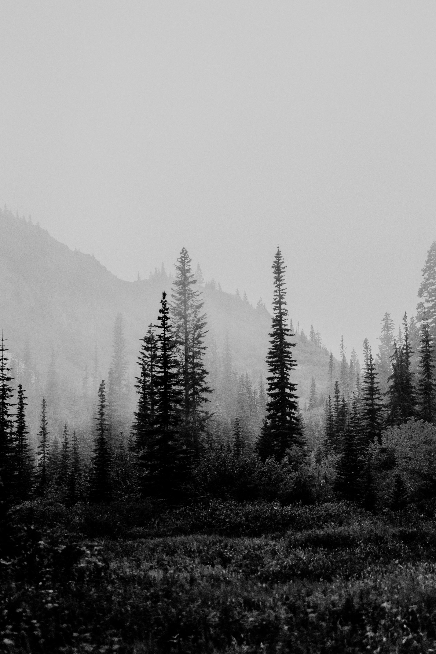
Window light. Backlight. Fog. A shaded forest. A stormy sky. Golden light slipping across a face. Street lamps at night. A mountain ridge holding shadow. A room with one practical light source. These conditions give the edit something to shape.
If the light is flat, the edit can still improve the image, but it has to work harder. That is where many creators start forcing mood onto a frame that was not built for it.
Before you edit, ask what the light is doing.
Where is the natural depth? Where is the subject separated? What part of the frame already carries atmosphere? What should stay visible? What can fall away? Does the image want a deep cinematic grade, or does it need a lighter hand?
The best moody editing begins with listening to the photograph.
Shadows need information
Shadows are the heart of moody editing, but they are not empty space.
A strong shadow can create mystery, shape, and emotional tension. It can make the subject feel grounded. It can give the image weight. But when shadows lose too much information, the edit starts to feel heavy in a lazy way.
The viewer does not need to see everything, but they need to sense that something is there.
This is especially important in portraits, weddings, lifestyle images, and cinematic video. If the shadow side of a face loses all detail, the subject may look harsh or disconnected. If a dark landscape loses every layer, the scene becomes a blob. If a wedding reception is graded too heavily, the joy of the room can disappear under the mood.
Use shadows intentionally.
Deepen them where they add structure. Protect them where they hold important texture, expression, or atmosphere. A good moody preset should create depth without punishing the image for having subtlety.
Contrast should create shape, not damage
Contrast gives cinematic edits their structure.
It separates subject from background, gives light more presence, and helps the image feel less flat. But contrast can also damage an image when applied without care.
Too much global contrast can make highlights harsh, shadows muddy, skin rough, and colors oversaturated. It can create an image that looks strong at thumbnail size but falls apart when you actually look at it.
A better approach is to shape contrast.
Use the tone curve with intention. Protect highlights that need softness. Let blacks deepen, but do not crush them automatically. Use local adjustments to guide the eye. Make the subject stronger without making every background element compete.
Cinematic editing often feels polished because the contrast has been controlled, not because everything has been turned up.
Color grading carries emotion
Moody and cinematic styles rely heavily on color.
Cool shadows can create distance, tension, or calm. Warm highlights can create intimacy, nostalgia, or life. Muted greens can make outdoor scenes feel grounded. Rich browns can add depth. Deep blues can carry night or melancholy. But color grading can become a costume if it overwhelms the subject.
The classic danger is forcing every image into the same teal-and-orange world whether it belongs there or not.
That look can be useful. It can also become a shortcut that makes every project feel like it is trying to sell a luxury SUV during a thunderstorm.
Ask what the image actually needs.
Does the grade support the subject? Are skin tones still believable? Does the environment still feel like itself? Is the mood coming from the image, or is the image being buried under the mood?
A good cinematic edit should make the color feel intentional without making the treatment feel louder than the photograph.
Skin tones still matter
Moody editing does not give you permission to ignore skin tones.
In fact, skin tones often matter more when the grade gets heavier. The viewer may forgive deep shadows or strong color shifts in the environment, but if people start looking lifeless, orange, green, or gray, the whole image feels wrong.
Protecting skin tones does not mean they have to stay bright and cheerful. A moody portrait can have subdued skin. A cinematic wedding frame can be warm and deep. A lifestyle image can carry shadow and atmosphere. But the person should still feel human.
Use masks if needed. Adjust orange and red channels carefully. Watch for color casts from grass, walls, neon, or mixed lighting. If a preset gives the overall image the right mood but damages the subject, refine the subject separately.
The viewer should feel the mood without losing connection to the person in the frame.
Do not overprocess texture
Texture tools are tempting in cinematic work.
Clarity, texture, sharpening, grain, dehaze, and contrast can all create a stronger feeling. Used well, they add detail and atmosphere. Used carelessly, they make the image crunchy, gritty, or fake.
Natural grain can be beautiful. It can bring warmth and character to digital images. But grain should feel like part of the image, not like someone sprinkled seasoning on top because the dish was undercooked.
The same is true for dehaze. A little can add depth. Too much can make skies strange, shadows harsh, and color unnatural.
Moody editing benefits from touch.
Not force. Touch.
Review the image after the first excitement passes
Heavy edits often look exciting at first.
That is part of the danger. You apply the preset, adjust the curve, deepen the colors, and the image suddenly feels more dramatic. You feel like you found it. Then you come back the next day and realize the edit is doing too much.
This is why stepping away matters.
Give your eyes time to reset. Compare the edit with the original. Look at it next to other images from the set. Ask whether the mood still feels appropriate or whether the processing has become the point.
A strong cinematic edit should hold up after the first rush.
It should feel intentional, not impulsive.
Depth comes from restraint
Moody and cinematic editing can create beautiful work when it respects the image.
Use shadow, but keep information where it matters. Use contrast, but shape it. Use color, but protect the subject. Use grain and texture, but do not let them become decoration. Let the edit deepen the feeling already present in the frame.
The goal is not to make every photograph look like a movie still.
The goal is to create visual depth that serves the story, the person, the place, or the atmosphere of the work.
Underexposure is easy.
Mood is craft.