
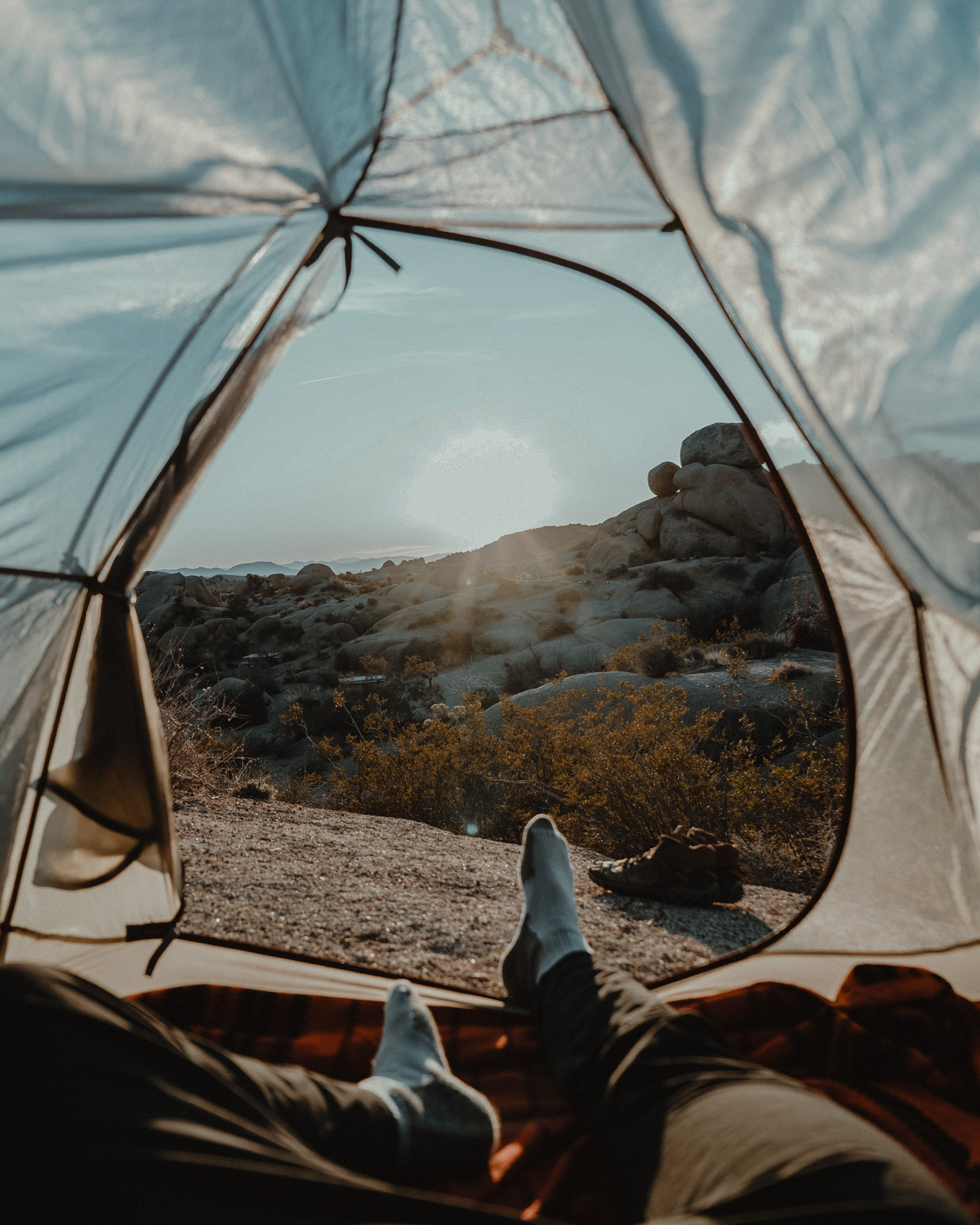

Natural color should be accentuated, not overwhelmed
Outdoor and landscape editing is a little like dressing well.
Stay with me.
Somewhere in my family history, my Italian grandma would have had very strong opinions before a date. The kind of advice that sounds funny at first and then turns out to be annoyingly wise: do not fight what is already working. Accentuate the natural shape. Do not overwhelm the person wearing the outfit. Let the best features breathe.
That is not bad editing advice.
The landscape already has a body. Mountains have lines. Rivers have movement. Pines have texture. Snow carries brightness. Fall hillsides hold warmth. Summer skies can light the whole frame like a blockbuster decided to film in your backyard. The job of the edit is not to drown the scene in your favorite preset until the land no longer recognizes itself.
The job is to accentuate the natural curves.
A good outdoor and landscape preset should strengthen what is already there. It should help color feel consistent, light feel intentional, and the scene feel alive without turning every image into a caricature of nature.
Outdoor light changes constantly
Landscape photographers do not work in controlled conditions.
The sun moves. Clouds pass. Smoke rolls in. Snow reflects blue into the shadows. Forests create green casts. Golden hour warms everything. Midday light gets harsh. Fog softens contrast. Rain deepens saturation. A mountain scene can change completely in ten minutes.
That is why outdoor editing requires both consistency and flexibility.
If your preset is too rigid, it will work beautifully on one scene and punish the next. If your editing has no system, every image becomes a separate decision, and your portfolio may start to feel scattered.
A strong outdoor preset gives you a consistent base, but your eye still has to adapt it to the light.
That adaptation is where style becomes craft.
Greens need special attention
Outdoor photography lives and dies by greens.
Pine forests, grass, moss, fields, alpine slopes, riverbanks, and spring hillsides can all shift dramatically in camera. Digital greens often come in too yellow, too saturated, too neon, or too flat. If you do not control them, they can steal attention from the subject or make the whole image feel less refined.
Many photographers solve this by desaturating greens aggressively.
That can work, but it can also make the landscape feel dead. The goal is not to remove green from nature. Nature tends to be emotionally attached to it. The goal is to shape green so it fits the visual world you are building.
Adjust hue, saturation, and luminance carefully. Watch how greens interact with skin tones if people are in the frame. Pay attention to the difference between pine, grass, sage, moss, and spring leaves. Not every green needs the same treatment.
Outdoor presets can help establish a grounded palette, but natural color still needs attention.
Skies should support the story
Skies are powerful, which is why they are so easy to overedit.
A dramatic sky can carry a landscape image. It can add scale, weather, tension, peace, or movement. But if the sky becomes too saturated, too dark, too blue, or too heavily dehazed, it can pull attention away from the land and make the edit feel fake.
The sky should support the story of the photograph.
Sometimes that means deepening clouds and adding contrast. Sometimes it means keeping the sky soft and open. Sometimes the sky is not the main subject and should not behave like it is auditioning for one.
Use masks if needed. Treat the sky separately from the foreground. Protect cloud detail. Keep gradients natural. Be careful with dehaze, especially along horizons, trees, and mountain edges.
A believable sky does more for the image than an impressive one that feels pasted on.
Build a consistent relationship between warmth and shadow
Outdoor images often have complex color temperature.
A sunset may warm the highlights while shadows stay cool. Snow can create blue shadows under golden light. Forest shade can turn skin green. Desert light can push everything warm. Mountain air can make distant layers blue and soft.
A consistent outdoor style often comes from how you handle the relationship between warmth and shadow.
Do you keep shadows cool? Do you warm them slightly? Do you allow golden light to stay rich? Do you keep whites clean? Do you preserve the natural separation between sunlit and shaded areas?
These choices create a visual through line.
They help a viewer recognize your work across different locations because the images share the same logic, even when the scenes change.
Do not make every landscape a postcard
Landscape editing can get trapped in postcard instincts.
Make the sky bluer. Make the grass greener. Make the sunset warmer. Make the mountains sharper. Make the water brighter. Make the whole thing look like a place a tourism board would approve while nodding solemnly over a conference table.
There is nothing wrong with beauty. The outdoors is, inconveniently for minimalists, often beautiful.
But an image can be beautiful without being exaggerated.
Sometimes the strongest landscape edit is quieter. It lets fog stay soft. It lets distant mountains fade. It lets shadows hold weight. It lets muted color tell the truth of the day. It does not force every scene into maximum appeal.
This is especially important if your outdoor work is part of a larger creative brand. Your editing should communicate your point of view, not just your ability to intensify a scene.
Use presets to create a base, then refine by environment
Outdoor and landscape presets are useful because they give you a starting point for common natural-light problems.
They can help with greens, contrast, warmth, sky treatment, shadow depth, and overall color harmony. They can help a gallery feel cohesive across changing conditions. They can speed up your workflow when you are editing a large set from a trip, shoot, or project.
But they are not a substitute for environmental awareness.
A snowy mountain image, a foggy spring field, a dry summer ridge, and a fall forest do not need identical treatment. Apply the preset, then look carefully. What does this place need? What does this light need? What should stay natural? What should be shaped?
That question keeps the edit honest.
Color consistency is part of visual trust
When your outdoor images hold together, the viewer feels it.
They may not know which sliders you adjusted, but they can sense that the work has a point of view. The colors belong to the same world. The landscapes feel related. The editing supports the place without overwhelming it.
That kind of consistency builds trust.
It makes portfolios stronger. It helps client galleries feel intentional. It gives brands a clearer visual identity. It helps photographers move through different environments without abandoning their style every time the weather changes.
Outdoor and landscape editing is not about making nature better.
Nature is doing fine. Arrogant, honestly.
The work is to notice what is already strong, accentuate it with care, and build a visual system that lets the land feel both honest and unmistakably yours.
Let the edit respect scale
One more thing matters with outdoor work: scale.
A landscape often feels powerful because of proportion. A person looks small against a ridge. A road disappears into the distance. A tree line gives the mountain its size. If the edit flattens those relationships, the place loses authority. Too much shadow lift can make the frame feel thin. Too much clarity can make distant layers feel pasted together. Too much saturation can make the scene feel smaller because every element is competing at the same volume.
Edit in a way that preserves distance.
Let far mountains stay a little softer. Let foreground texture carry detail without overwhelming the horizon. Let haze, fog, smoke, and weather remain part of the atmosphere when they belong. Natural light is not only something to correct. Sometimes it is the very thing that gives the image memory.










