.jpg)

Best Seasonal Presets for Photographers Working Across Changing Light
The light does not ask permission before changing the rules.
Winter gives you blue shadows, bright whites, and snow that reflects everything around it like a gossip with excellent memory. Spring brings fog, green hillsides, wet earth, and soft mornings that feel almost too gentle to edit aggressively. Summer dries out the landscape, warms the grass, and throws sunsets across Montana that could light a Michael Bay film. Fall arrives with deeper reds, oranges, browns, and enough visual drama to make every photographer suddenly consider becoming a leaf specialist.
Each season has its own color language.
That is beautiful, but it creates a problem for photographers who want a consistent style. If your edits follow the season too loosely, your portfolio can feel scattered. If you force every season into one rigid look, the images stop feeling honest.
Seasonal presets are useful because they help you adapt without abandoning your visual identity.
The goal is not to make every month look the same.
The goal is to let each season be itself while the work still feels like yours.
Winter Needs Control, Not Panic
Winter images are full of contrast and color problems that do not announce themselves politely.
Snow can go blue, gray, or blown out. Shadows in the mountains can become deep and cold. Bright whites can lose detail. Skin can look too red, too pale, or too cold depending on the light. And all of this happens while your fingers are trying to operate a camera through gloves that make every button feel like it was designed by a tiny villain.
A good winter preset should help control the blues without removing the cold.
That distinction matters. Winter should still feel like winter. The shadows can stay cool. The air can feel crisp. The snow can hold brightness. But the image should not feel dead or overly blue.
Winter presets need to protect whites, manage shadow color, preserve detail, and create enough contrast that the image does not flatten into one cold wash.
The best ones give you a clean starting point so you can adjust for the real scene. Snow in open shade, snow at sunset, snow in the mountains, and snow in town all behave differently.
Winter is not one preset setting.
It is a season that requires attention.
Spring Needs Freshness Without Turning Neon
Spring can be visually stunning and surprisingly dangerous in editing.
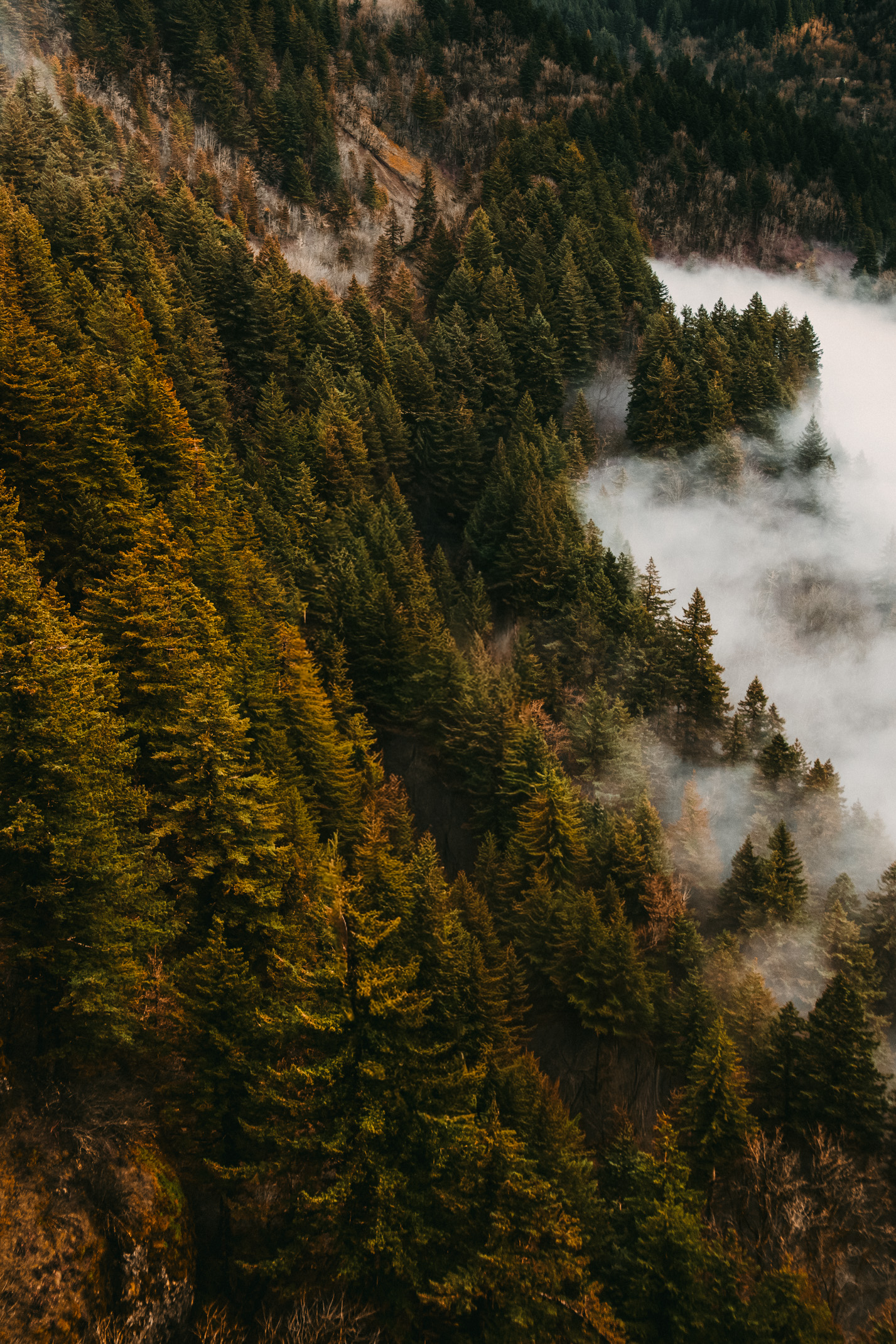
The greens return. Fog lifts over fields. Rain deepens the earth. Mountains sit behind soft mornings. Everything feels alive again, which is exactly why a photographer can get carried away and turn the landscape into a glowing emerald fever dream.
Spring presets should handle greens carefully.
You want freshness, not neon. You want the feeling of new life without making every hillside look radioactive. Jewel tones can be beautiful in spring, especially when the air is wet and the light is soft, but saturation needs restraint.
A good spring preset should preserve atmosphere. Fog, mist, moisture, and soft skies are part of the season. Do not dehaze every image into hard clarity just because the slider is there and you own a mouse.
Spring often works best with a lighter hand: clean whites, natural greens, gentle contrast, and enough warmth to keep the image from feeling cold.
The goal is not to make spring louder.
It is to keep it alive.
Summer Needs Warmth With Discipline
Summer light can be bold.
In Montana, it can feel dry, golden, dusty, and wide open. The sunsets hit hard. The grass shifts. The air can make everything feel warm before you ever touch a slider.
That warmth is beautiful, but it can get out of hand quickly.
Summer presets should help preserve golden light without turning the entire image orange. This is especially important when people are in the frame. Skin tones already live in the orange family, so heavy warmth can make portraits look overcooked.
A strong summer preset keeps warmth controlled. It protects skies, holds enough contrast, and lets dry landscapes feel natural. It should support the heat and light of the season without making every photo feel like it was edited under a heat lamp.
Summer also needs texture. Dust, grass, trails, mountains, water, and skin all respond differently to contrast and clarity. The preset should give the image shape without making everything harsh.
Summer can carry drama.
It just does not need to shout the whole time.
Fall Needs Richness Without Mud
Fall is easy to love and easy to overedit.
The colors are already doing a lot. Reds, oranges, yellows, browns, dry grasses, warm trees, and low sunlight all create a strong visual palette. A photographer can look at a fall image and think, “What if I just add more?”
That is how rich becomes muddy.
Fall presets should deepen color without crushing separation. The oranges should not all become one heavy tone. The reds should not overpower skin. The browns should still have texture. The shadows should give depth without making the scene feel dirty.
A good fall preset respects the warmth that is already there.
It may add contrast, deepen tones, and create a more polished mood, but it should not flatten every color into the same autumn soup.
Fall editing works best when the image keeps its layers. Leaves, clothing, skin, sky, wood, fields, and shadows all need room to exist.
The season is generous.
Do not make it do more than it needs to.
Consistency Comes From Defaults
Seasonal editing gets easier when you know what stays consistent across the year.
Your warmth may shift. Your greens may adapt. Your whites may need different treatment. Your shadows may be cooler in winter and deeper in fall. But certain defaults should remain recognizable.
Maybe your work always protects natural color. Maybe it keeps skin tones warm and believable. Maybe the contrast stays grounded. Maybe the highlights stay clean. Maybe your images carry a soft film-inspired character. Maybe the mood is adventurous, romantic, clean, or cinematic.
Those defaults are the through line.
Seasonal presets should support them while adapting to the light in front of you. They should help your winter, spring, summer, and fall images belong to the same photographer without pretending the seasons are interchangeable.
That is the real value.
A flexible style can move through the year without losing itself.
Choose Seasonal Tools That Respect the World
The best seasonal presets help photographers respond to changing light with more confidence.
They do not flatten every month into one look. They do not ignore the difference between snow, fog, dry grass, green hills, summer heat, and fall warmth. They give creators a strong starting point for the season they are actually editing.
That matters because photography is partly about attention.
The season is telling you something. The color of the shadows, the air, the sky, the grass, the trees, the snow, the warmth, the cold. Your edit should listen before it speaks.
Choose presets that preserve a consistent visual identity while respecting what makes each season unique. Use them to reduce friction, build cohesion, and keep your work recognizable across the whole year.
A strong style does not fight the seasons.
It learns how to move through them.
Let the Season Change the Questions
Each season asks a different editing question. Winter asks how much cold to keep. Spring asks how much green is too much. Summer asks how to preserve warmth without overcooking the frame. Fall asks how to deepen color without turning richness into mud. A good seasonal preset helps you answer the question in front of you instead of forcing every file through the same year-round formula.
Seasonal editing also asks for patience. A winter preset may need more highlight control. A spring edit may need softer saturation. A summer look may need disciplined warmth. A fall edit may need stronger separation between reds, oranges, and browns. The preset should start the conversation. Your eye still finishes it based on the actual light, place, and subject in front of you.
The strongest seasonal tools feel like a set of field notes for the year. They remind you what to protect, what to adjust, and where the image is most likely to break. That kind of support helps photographers move faster without ignoring the personality of the season.
That small adjustment protects both consistency and honesty.