.jpg)

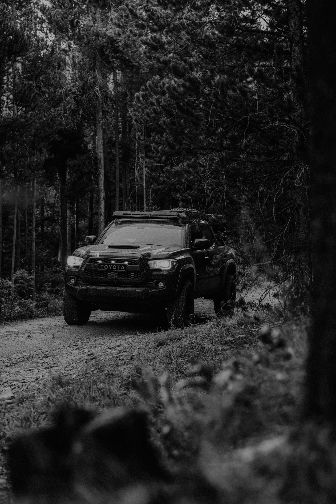
Moody Does Not Mean Underexposed
Somewhere along the way, photographers started confusing moody with dark. The shadows dropped, the exposure sank, the blacks got crushed, and every image began to look like it was photographed from inside a closet during a power outage.
That is technically a mood. It is just not a good photo.
A moody edit is not created by hiding the subject. It is created by using light, shadow, color, and contrast to draw attention where it belongs. The best moody images still have life in them. They still let the viewer see, feel, and understand the photograph. They do not bury the story under a blanket of dramatic intention.
If the viewer has to work too hard to find the subject, the edit is probably serving itself more than the image. Mood should pull people in. It should not make them wonder whether their screen brightness is broken.
Use Light as the Paintbrush
Moody editing starts with light. A dancer standing in a sliver of window light. A bride tucked near a curtain, half in shadow, half in anticipation. A face turned toward a soft lamp while the room falls away. These images feel moody because the light creates emphasis.
The edit should follow that emphasis. Deepen the shadows around the subject, but preserve the light that reveals them. Add contrast where it gives shape. Let the brightest meaningful area guide the viewer. A good moody edit understands that darkness is only powerful because something is illuminated against it.
That is the difference between atmosphere and underexposure. Atmosphere has intention. Underexposure often just has a slider with too much confidence. Before you darken the image, ask what the light is already trying to show you.
Keep the Subject Alive
The subject is the reason the edit exists. That might be a person, a landscape, a building, a detail, or a gesture, but something in the frame deserves attention. Moody editing should protect that thing, even if the rest of the image gets heavier.
This matters especially with people. Skin can get muddy quickly in dark edits. Eyes can disappear. Hair can merge into the background. Clothing can lose texture. Once the subject starts vanishing, the mood becomes a problem.
Use local adjustments when needed. Lift the face slightly. Protect catchlights. Bring back detail in the hands or clothing. Add subtle warmth where the subject needs presence. These small corrections do not ruin the mood. They make the mood readable. The viewer should feel the shadow around the subject, not lose the subject inside it.
Let Shadows Hold Detail Where It Matters
Deep shadows are part of moody editing, but not every shadow needs to be a black hole. Some can go dark. Some can stay mysterious. Some should keep detail because they help the frame feel real.
Look at the role each shadow plays. Background shadows can often fall away. Edges can darken to guide the eye. But shadows on skin, clothing, important architecture, or foreground elements may need enough information to keep the image from feeling blocked up.
A strong moody edit often has more range than people realize. It may include rich blacks, soft midtones, controlled highlights, and pockets of warmth. The depth comes from relationships between tones, not from dragging everything downward. Darkness without separation becomes mud. Darkness with shape becomes atmosphere.
Use Color to Support the Emotional Weight
Moody images often benefit from controlled color. Warm highlights against cool shadows. Muted greens. Deep blues. Earthy oranges. Slightly desaturated backgrounds. These choices can help the photograph feel more cinematic, intimate, or serious.
But color should not become a costume. If every moody image gets the same teal shadows, orange highlights, and crushed blacks, the style starts to feel less like a point of view and more like a preset refusing to leave 2016. The image still needs context.
A quiet bridal portrait may need warmth and softness. A stormy landscape may need cool shadows and strong depth. A street image may need grit and contrast. A musician portrait may carry heavier color. Let the subject, light, and intended feeling decide how far the color grade should go.
Do Not Confuse Drama With Emotion
Drama is easy to add. Emotion is harder to preserve. You can make almost any image feel more dramatic by darkening it, adding contrast, reducing saturation, and shifting the color. That does not mean the image has more meaning.
The emotional weight usually comes from the moment itself. A glance. A posture. A pause. A landscape under weather. A room holding quiet tension. The edit should help the viewer notice what was already present. If the edit overpowers the moment, the image may look impressive but feel hollow.
This is where restraint matters. Some photos need a gentle hand. Some can carry a heavy grade. Some should remain quiet. Moody editing is most powerful when it feels discovered inside the image, not imposed on top of it.
Build Depth Without Killing the Photo
A tasteful moody edit gives the image depth, focus, and atmosphere while preserving enough life for the viewer to care. It lets darkness do real work, but it does not worship darkness for its own sake.
Start with the light. Protect the subject. Use shadows to shape the frame. Keep detail where it matters. Let color support the emotional tone. Then step back and ask whether the photograph feels stronger or simply heavier.
If the edit makes the subject clearer, the mood richer, and the story more focused, you are probably on the right track. If it makes everything harder to see, harder to feel, and harder to trust, pull back. The best moody images do not crush the life out of the photo. They give the life somewhere deeper to live.
Moody Editing Works Best With a Clear Subject
A moody edit needs a subject strong enough to hold the weight of the atmosphere. That subject does not always have to be a person, but it does need to be clear. It might be a bride in window light, a mountain ridge under storm clouds, a musician in a dark room, or a table detail lit by candles. Something has to receive the viewer’s attention.
When there is no clear subject, moody editing can become a way of hiding the problem. The image gets darker, the color gets heavier, and the frame starts looking more intentional than it really is. But the viewer still does not know what matters. Darkness can create mystery, but it cannot replace composition.
Before finishing a moody edit, ask where the eye lands. If the answer is nowhere, the problem may not be the grade. It may be the frame.
Let the Mood Match the Moment
Not every photo deserves the same level of drama. A quiet, tender image may need softness more than heavy shadow. A stormy landscape may carry a deeper edit naturally. A dance floor photo may need movement and contrast rather than the same muted treatment you would use for a portrait. Mood has to match the moment.
That is where taste shows up. You are not trying to prove that you can make every image dramatic. You are trying to make the right images feel deeper, stronger, and more emotionally clear. Sometimes the most mature moody edit is the one that leaves a little more light in the frame.
Use a Before-and-After Test
A before-and-after check can be humbling in the best way. Toggle the edit off and on, then ask what the mood actually improved. Did it help the subject stand out? Did it create emotional depth? Did it strengthen the light? Or did it simply make the photo darker and more dramatic in a way that feels impressive for three seconds and exhausting after ten?
This is where moody edits become more mature. You learn to keep the moves that serve the image and remove the ones that are only performing style. Sometimes the best correction is not another adjustment. It is pulling the edit back until the subject can breathe again.
Mood should feel like atmosphere in the room, not a heavy coat thrown over the photograph.
A Practical Mood Rule
A useful rule is this: if the edit makes the viewer feel the subject more clearly, keep going. If it makes the viewer notice the edit more than the subject, pull back. Moody editing should feel like a room with the lights set intentionally, not a room where someone simply forgot to pay the electric bill. The shadows should create focus. The color should create atmosphere. The final image should feel deeper, not just darker.








.jpg)