.jpg)

Film-Inspired Editing Should Feel Earned
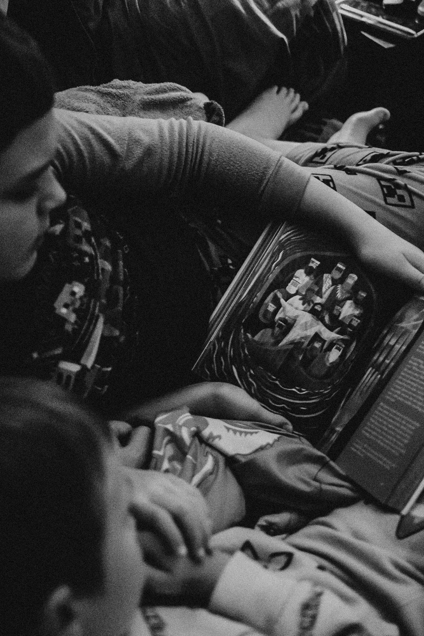
I am an absolute sucker for natural grain. The warmth it can bring to digital images deserves a place somewhere near the great innovations of the twentieth century, right after modern medicine and whatever person first decided fries should come with dipping sauce.
That may be a slight overstatement. But only slight.
Film-inspired editing can be beautiful. It can add warmth, texture, softness, imperfection, and emotional character to digital files that might otherwise feel too clean. The problem is not film inspiration. The problem is when the edit becomes fake nostalgia. Heavy sepia, muddy color, fake grain, and overdeveloped tones can make a photo feel like an Instagram filter from 2012 found a leather jacket and started talking about authenticity.
Start With Context
Context decides whether film-inspired editing works. A quiet portrait in warm window light may carry grain beautifully. A wedding reception with direct flash may come alive with analog character. A travel image from a dusty road might feel more honest with softened contrast and warmth. A sterile product image for a clean tech brand may not need to look like it was discovered in your grandfather’s glove box.
Sepia is a good example. Used carefully, warmth can create memory. Used without context, sepia makes the image feel like it is pretending to be older than it is. Not every photo deserves a nostalgic treatment. Some images need clarity. Some need color. Some need to stay modern.
Film-inspired editing works best when the look supports the subject instead of trying to manufacture emotional depth that was not there.
Use Grain Like Texture, Not Decoration
Grain is one of the most appealing parts of film-inspired editing because it adds texture to digital smoothness. It can make an image feel more tactile, less sterile, and more human. But grain should feel integrated into the photo, not sprinkled on top like seasoning after the meal is already plated.
Too much grain can distract, especially in skin, skies, or clean backgrounds. Too little may not contribute anything. The right amount depends on the image, resolution, lighting, and final use. A moody portrait may carry heavier grain than a bright commercial image. A night street photo may welcome texture. A clean lifestyle shoot may need just a hint.
Good grain feels like part of the image’s surface. Bad grain feels like a filter trying to prove it read a photography book.
Keep Color From Becoming a Costume
Film-inspired color often includes warm highlights, softer greens, muted blues, lifted blacks, or less clinical saturation. These choices can add character, but they can also become overdeveloped quickly.
Oversaturated oranges, muddy shadows, and strange greens can make the edit feel forced. Heavy color shifts may look interesting in isolation and still fail the image. The goal is not to convince people the photo was shot on film. The goal is to borrow the qualities of film that serve the digital image.
That distinction matters. If you are editing digital files, let them be digital files with character. You do not have to fake a process you did not use. You can honor the inspiration without pretending the file came from a roll of film found in a shoebox under suspiciously perfect light.
Protect the Subject First
Film-inspired presets can be rough on skin if they are not adjusted carefully. Warmth, grain, lifted blacks, faded color, and shadow shifts all affect the person in the frame. A look that feels beautiful on a landscape may make a portrait feel muddy or tired.
Check the subject before committing to the style. Does the skin still feel alive? Are the eyes clear? Did the grain become distracting on the face? Did the warmth flatter the scene or turn everyone orange? Did the lifted blacks add softness or remove needed shape?
The person matters more than the emulation. If the style makes the subject less present, pull it back. Film character should add feeling, not hide the human being the photo is about.
Let Imperfection Serve the Image
Part of the beauty of film is imperfection: grain, halation, softness, color shifts, light leaks, motion, and the sense that the image has a physical life. Digital photography can feel too clean by comparison, which is why analog-inspired tools are so appealing.
But not every imperfection adds value. Fake light leaks on the wrong image feel silly. Heavy grain on a clean brand portrait may feel distracting. Faded color can be beautiful, but it can also make a strong image feel weak. The imperfection has to serve the mood.
Use analog character like seasoning. Enough can bring out the flavor. Too much makes the whole thing taste like the seasoning. And yes, that is now officially a photography metaphor. We are all doing our best.
Make It Feel Honest
Film-inspired editing is strongest when it feels honest to the image. It should support the light, subject, and emotional tone. It should add warmth, grain, softness, or character in a way that feels integrated. It should not feel like the photo is wearing a costume to seem more meaningful.
When reviewing the final edit, ask whether the style helped the photograph become more itself. Did the grain add texture? Did the warmth support memory? Did the muted color create restraint? Did the image still feel believable?
You do not need to choose between digital clarity and analog character. You can use both. Just keep the context in charge. Film-inspired editing should feel like a thoughtful translation, not a gimmick. The image should still be good when the nostalgia stops talking.
Keep the Digital Strengths Too
One mistake in film-inspired editing is acting like digital photography has nothing to offer. Digital files have flexibility, clarity, dynamic range, and precision. Those strengths are not enemies of character. They are part of what makes a thoughtful analog-inspired edit possible.
You do not need to sabotage the file to make it feel less digital. You can keep clean detail where it matters, preserve strong color when the image asks for it, and still add warmth, grain, softness, or fade. The best film-inspired edits are not ashamed of being digital. They simply borrow the emotional texture of film where it helps.
That balance makes the work feel more honest. It is not pretending. It is interpreting.
Use Analog Style Across a Set
Film-inspired editing becomes more believable when it is consistent across a body of work. One heavily nostalgic image can look interesting. Ten images with a thoughtful, related treatment start to feel like a point of view. The viewer can sense that the warmth, grain, and color choices belong to a larger visual language.
This is also where overdone effects become obvious. If every photo has the same heavy sepia or fake fade, the gimmick gets louder with repetition. A consistent analog style should still have nuance. Some images may carry more grain. Some may stay cleaner. Some may hold richer color. The thread should be recognizable, not robotic.
Film inspiration works best when it becomes a system of taste, not a single effect repeated until it loses meaning.
Do Not Confuse Old With Meaningful
One of the easiest mistakes in film-inspired editing is assuming that older-looking automatically means more meaningful. It does not. A faded tone, warm cast, or heavy grain can suggest memory, but if the photo itself has no emotional center, the effect will feel like decoration.
Meaning comes from the subject, the light, the timing, and the way the image holds attention. Analog character can deepen that meaning, but it cannot replace it. A strong photograph with restrained film warmth can feel timeless. A weak photograph with heavy nostalgia usually just feels like it is trying to borrow someone else’s past.
Let the image earn the mood before the preset tries to age it.
Let Nostalgia Be Specific
Nostalgia works best when it is specific. A little grain on a road trip image feels different than heavy warmth on a corporate headshot. A faded wedding reception photo can feel alive because the moment already carries memory. The same treatment on the wrong frame can feel fake. Film-inspired editing should ask what the image is remembering before it decides how old it wants to feel.
A Good Film Edit Still Needs a Strong Frame
This is why film-inspired editing is not a shortcut around craft. The frame still needs composition, light, timing, and subject. Grain can add beauty, but it cannot make a careless image meaningful. Warmth can create memory, but it cannot replace connection. The analog treatment works best when it is added to a photograph that already has something worth remembering.