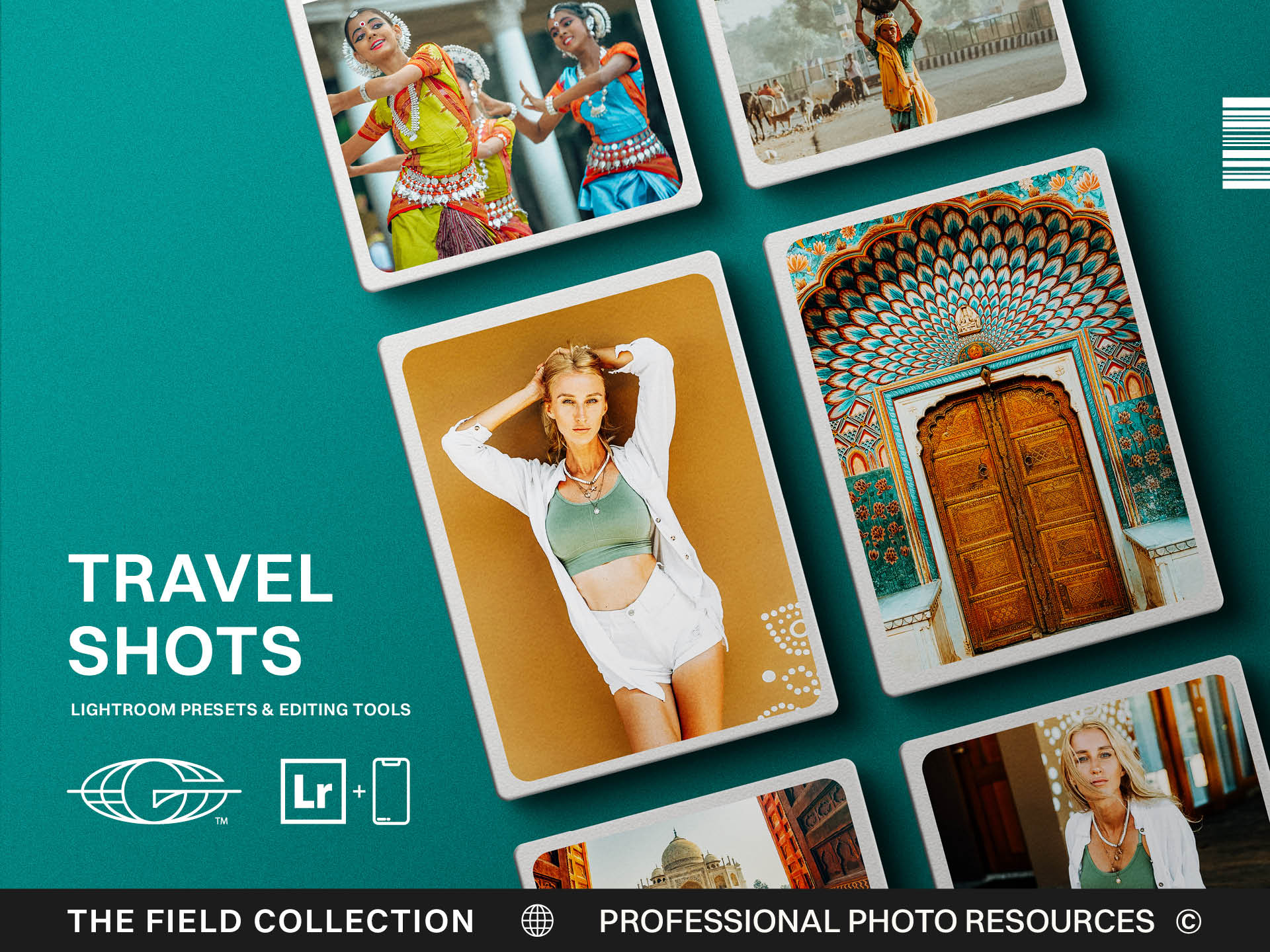
Continuity of color is continuity of narrative
Travel and adventure photography can become scattered fast.
One day you are shooting mountain roads under cold blue light. The next, you are editing a dusty overlook at sunset. Then a forest trail, a city street, a lake, a campsite, an airport window, a coastal morning, a desert highway, a coffee shop table covered in maps and crumbs, because apparently adventure still requires breakfast.
Every location has its own color. Every day has its own weather. Every camera setting, lens choice, time zone, and mood can shift the way the work feels.
That variety is part of what makes travel photography interesting.
It is also what makes it difficult to edit as one body of work.
Continuity of color is continuity of narrative. If the colors swing wildly from place to place, the viewer can feel the thread break. The images may be strong individually, but the story begins to feel disconnected. A brand project, travel essay, client campaign, or personal series needs enough visual consistency that the audience understands the images belong together.
The goal is not to make every location look the same.
The goal is to make every location feel like it was seen by the same eye.
Start with the story of the trip
Before you edit, ask what the body of work is trying to say.
Is this a rugged adventure story? A quiet personal travel essay? A brand campaign about movement and exploration? A family road trip? A documentary project? A collection of images from the field meant to support a larger creative identity?
That answer matters because it shapes the edit.
A bright, clean travel series may need open shadows, natural color, and a sense of ease. A rugged outdoor campaign may need stronger contrast, earthier tones, and more texture. A cinematic adventure set may lean into deeper shadows and richer color. A documentary series may need restraint so the place feels truthful.
If you skip this step, you will edit each image based only on what looks good in the moment.
That is how visual threads get lost.
Let the preset establish the base language
Travel and adventure presets are especially useful because they create a base language across changing conditions.
A good preset can help establish contrast, warmth, greens, blues, shadows, highlights, and overall mood. It gives the series a shared starting point so every image does not feel like a separate negotiation with Lightroom.
But a base language is not a final edit.
A shot from a snowy ridge and a shot from a warm desert road may begin with the same preset family, but they will need different refinements. A shaded forest will need different color work than a bright alpine lake. A portrait in golden light will need different care than a landscape under overcast skies.
The preset gives you the accent.
You still have to speak to the place you are in.
Protect the feeling of each location
Consistency should not erase location.
That is one of the biggest mistakes in travel editing. The photographer wants the images to feel cohesive, so every place gets pushed into the same palette. Snow loses coldness. Tropical greens become muted beyond recognition. Desert warmth gets cooled down. City lights lose their glow. The locations technically match, but they stop feeling like themselves.
A strong visual thread allows difference.
Montana snow should not feel the same as a summer coast. A foggy green hillside should not be forced into the same mood as a sunburnt canyon. The viewer should feel the shift in place, weather, and atmosphere.
The consistency should come from your editing logic: how you handle skin tones, contrast, shadow depth, greens, warmth, highlights, and texture.
Think of it like a storyteller's voice. The chapters can happen in different places, but the narrator remains recognizable.
Watch the greens, blues, and warmth
Travel work often changes most dramatically in greens, blues, and warmth.
Greens shift between pine, grass, jungle, moss, sage, and spring fields. Blues shift between skies, oceans, shadows, snow, distant mountains, and evening light. Warmth shifts with sunsets, deserts, city lights, skin tones, firelight, and reflected color.
If those colors are uncontrolled, the series can feel uneven.
Create a consistent approach. Maybe your greens stay earthy and natural rather than neon. Maybe your blues remain clean but not overly saturated. Maybe your warmth comes from light sources and skin rather than a global orange wash. Maybe your shadows can be cool, but not so cool that every location feels emotionally distant.
These choices become your visual thread.
They help images from different locations live together without pretending they were shot in the same place.
Review the images as a sequence
Travel and adventure work should be reviewed in sequence, not only one image at a time.
Place the images in the order someone might experience them: the road, the arrival, the landscape, the details, the people, the movement, the quiet in-between moments. Look at the transitions. Does one image feel too warm next to the next? Does a moody frame interrupt a clean sequence? Does one location feel like it belongs to a different project?
A single image can look great alone and still break the story.
This is where editing becomes curation. You are not only adjusting sliders. You are deciding how the viewer moves through the experience.
Sometimes an image needs a different edit. Sometimes it needs to be removed. Sometimes it belongs somewhere else in the sequence. Sometimes the strongest thing you can do for the visual thread is admit that not every good image belongs in the same set.
Keep brand consistency in mind
If the images support a client's brand, consistency matters even more.
A travel campaign may include multiple locations, but the brand still needs to feel stable. The visuals need to carry the same tone whether the subject is on a mountain road, inside a cabin, beside a lake, or moving through an airport. The viewer should understand the brand's world even as the scenery changes.
That is why continuity of color becomes continuity of narrative.
Color tells the audience whether they are still inside the same story.
For photographers serving brands, this is part of the value you bring. You are not just delivering strong individual images. You are helping the client create a visual system that can move across location, weather, platform, and campaign without losing its identity.
That is worth taking seriously.
Do not chase a new style in every place
Travel can tempt you to reinvent your style constantly.
A new place has its own visual pull. You see different light, colors, textures, people, architecture, landscapes, and weather. It is natural to respond creatively. That responsiveness is part of the joy.
But if every destination causes a full style change, your work can lose its center.
Let the place influence you, but do not surrender your eye every time you pack a bag.
The strongest travel and adventure photographers often carry a recognizable point of view across wildly different environments. They adapt, but they do not disappear into the location. Their work feels curious and consistent at the same time.
That is the goal.
Build a thread strong enough to travel
A travel and adventure editing style should be flexible enough to honor different places and strong enough to hold them together.
Use presets to create a base language. Refine by environment. Protect the feeling of each location. Watch greens, blues, warmth, and skin tones. Review the series as a sequence. Think about the narrative, not just the individual frame.
When the editing works, the viewer feels the journey without feeling the seams.
Different roads. Different skies. Different weather. Different subjects.
One visual thread.
That is what makes travel work feel like a story instead of a folder full of nice photos.