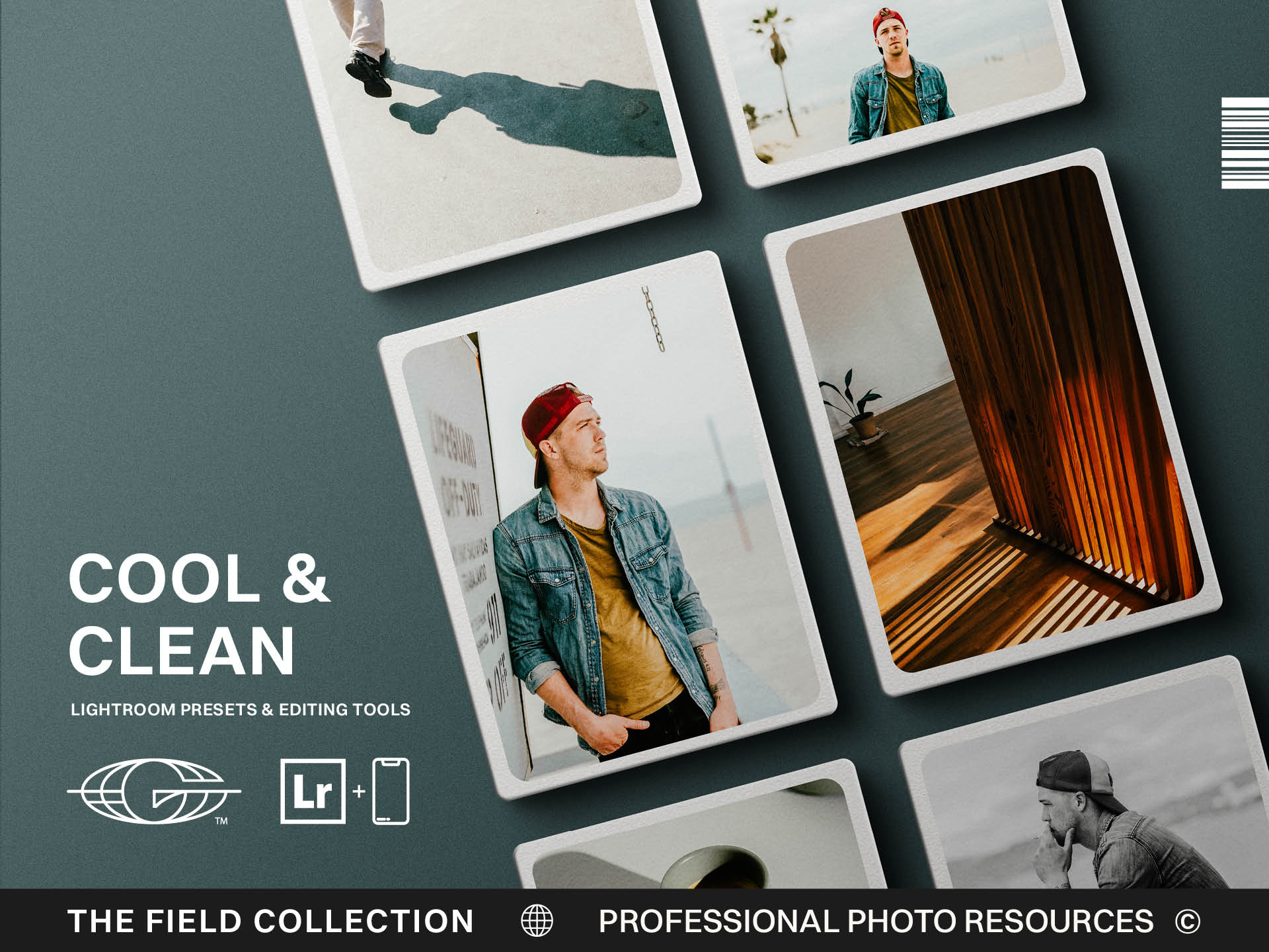
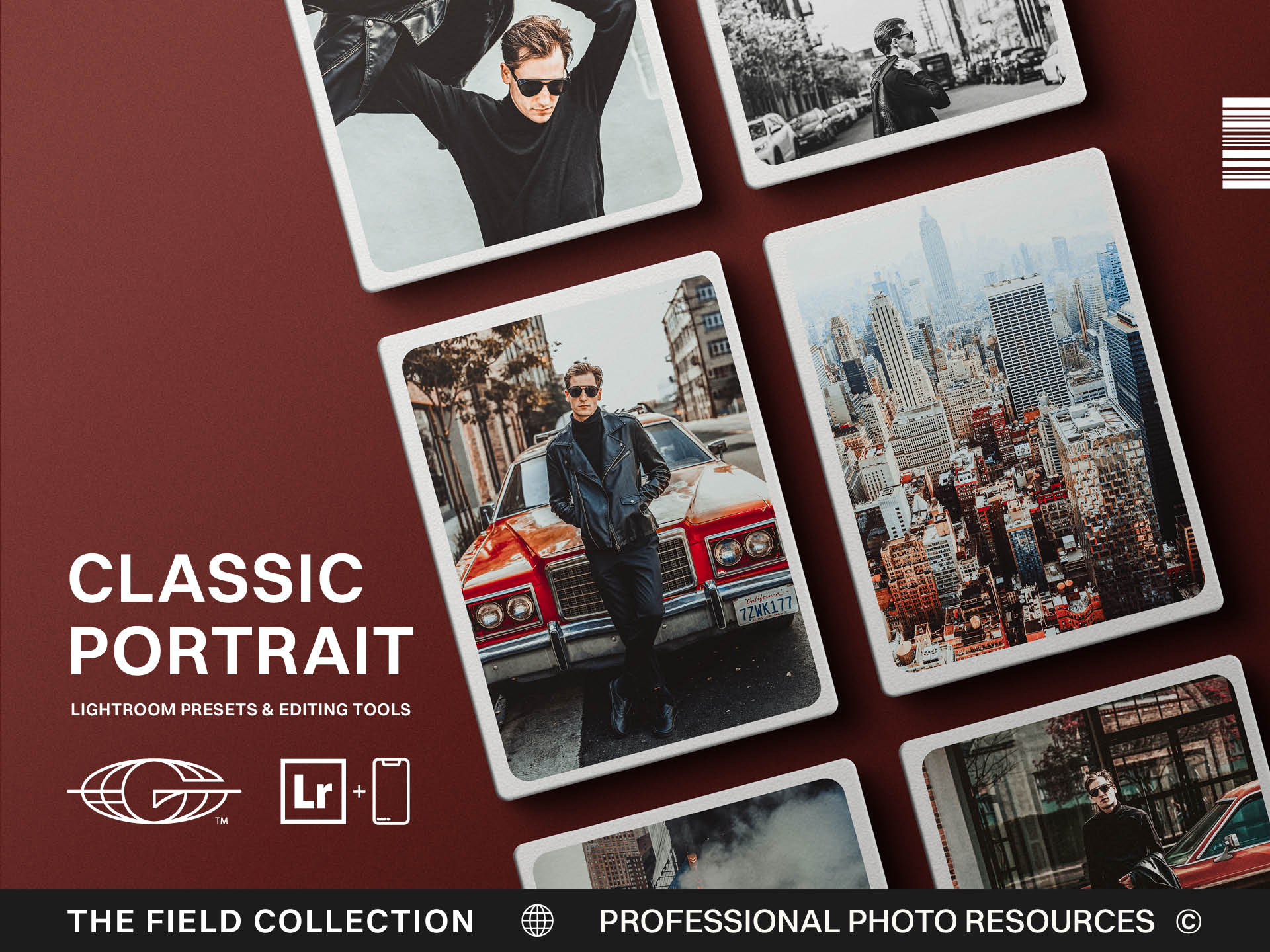
.jpg)

Best Presets for Portrait and Lifestyle Photographers Who Care About Skin Tones
The easiest way to ruin a portrait is to forget there is a real person inside it.
That sounds obvious, but editing has a way of making people abstract. A face becomes tones. Skin becomes orange values. Texture becomes something to smooth, brighten, sharpen, soften, warm, cool, or wrestle into whatever look is currently popular. Before long, the person in the image starts to look less like themselves and more like an idea of what a portrait is supposed to look like on the internet.
Portrait and lifestyle presets need to be chosen carefully because the subject is human.
A landscape can survive a heavy color grade more easily than a face can. A city street can carry grit. A mountain can handle dramatic contrast. But skin tones tell the truth quickly. If the edit goes wrong, people feel it immediately, even if they cannot explain what happened.
The best portrait presets support healthy skin tones, preserve texture, and keep the person’s presence at the center of the image.
Editing should enhance someone.
Not replace them.
Watch the Oranges
All skin tones live somewhere in the orange family.
That does not mean everyone should be edited orange. It means orange is a dangerous place to get reckless. Push warmth, saturation, or hue too far and skin can turn heavy quickly. People start looking sunburned, muddy, waxy, or like they have been gently roasted under a heat lamp.
And yes, even my Irish Butte friends who burn when the sun merely thinks about them still deserve better than an overcommitted orange slider.
Good portrait presets need to handle warmth with restraint. Warmth can make an image feel alive, romantic, and inviting. Too much warmth makes people look less real. The line is not always wide.
When testing portrait presets, look at different skin tones, lighting conditions, and environments. A preset that looks beautiful on one model in perfect light may behave very differently on someone with deeper skin, red undertones, olive tones, or pale skin in open shade.
Skin is not a single setting.
A strong preset gives you a base that respects that complexity. It should make skin feel healthier and more present without forcing every person into the same color story.
Preserve Texture Without Being Cruel
Portrait editing has two opposite traps.
One is over-smoothing. Skin becomes plastic. Faces lose texture. The person starts looking like a digital doll who has never had a pore, a long week, or a human experience.
The other trap is over-sharpening and over-clarity. Every line, texture, blemish, and shadow gets pulled forward with the enthusiasm of a detective presenting evidence. The image may feel detailed, but not kind.
A good portrait preset should avoid both.
People should look real. Real does not mean harsh. It means believable. It means texture remains, but the edit supports the person rather than exposing them. It means the photograph carries presence, not performance.
Lifestyle photography especially needs this balance because the images often feel more natural and relational. The viewer should feel the moment before they notice the processing. If the edit makes the skin look artificial, the whole image loses trust.
Presets can help create a flattering base, but the photographer still needs to use judgment. Some images need softness. Some need contrast. Some need a careful local adjustment. Some need you to stop editing before you start solving problems that no normal person would ever notice.
Editing people requires taste and mercy.
Let the Mood Support the Person
A portrait preset should not drag the person into a mood that does not fit the photograph.
This happens often with trendy styles. A joyful family image gets edited into moody desaturation because the photographer likes the look. A warm lifestyle session becomes cold and distant. A strong editorial portrait gets softened until all the power leaves the frame. A quiet image gets pushed into drama it did not ask for.
The edit should serve the subject.
That means reading the person, the light, the pose, the environment, and the emotional tone of the photograph. A preset can set the direction, but it should not override what is already there.
Lifestyle work often depends on authenticity. The laugh, the touch, the expression between posed moments, the nervousness settling into comfort. Those details can get lost if the edit becomes too heavy-handed.
I rarely shoot people without music and a set mood because most average people do not naturally love being in front of a camera. Music lowers the tension. It gives people something to move with. It gets them out of their head for a few minutes, which is often where the best images begin.
The edit should continue that work.
It should help the person feel warm, present, and comfortable in the final frame.
Choose Presets That Handle Real Light
Portrait and lifestyle photographers rarely get perfect light all day.
You may shoot in a living room, a backyard, a studio, a street, a field, a coffee shop, a wedding venue, or a brand space with windows that looked better in the scouting photos. Light changes. Walls cast color. Shadows fall across faces. Skin picks up warmth from wood, green from grass, blue from shade, and whatever color was apparently popular in interior design the year the room was built.
Presets need to handle that reality.
A strong portrait preset should give you a stable base while leaving room to correct white balance, exposure, and color casts. It should not explode the moment the light is less than perfect. It should help you move faster while still allowing careful adjustments to skin.
This is where clean, airy, natural, and lifestyle-focused presets can be useful. They often aim for a polished base that keeps people recognizable and flattering without dragging every image into heavy mood.
But even a clean preset needs contrast. Bright does not mean washed out. Natural does not mean flat. A portrait still needs shape, depth, and attention.
The best presets give you a strong starting point and let the person remain the point.
Don’t Let Style Become a Costume
Every photographer wants a recognizable style.
That is good. A consistent style helps clients choose you. It makes your portfolio feel cohesive. It gives the work a through line. But portrait style should never become a costume that every person is forced to wear.
The subject matters.
A preset pack should support your visual identity while still allowing the person to remain themselves. If every portrait looks like the same mood, same warmth, same skin, same softness, and same emotional tone regardless of who is in the frame, the edit may be too rigid.
People are not props for your color grade.
They bring personality, movement, discomfort, confidence, humor, awkwardness, beauty, and all the small contradictions that make portraits interesting. The edit should make room for that.
Choose presets that create consistency but leave space for individual presence.
That is where portrait and lifestyle editing becomes stronger. The work feels connected across a portfolio, but each person still feels seen.
Keep the Human Being at the Center
The best portrait presets are not the loudest ones.
They are the ones that help the person come through.
Look for healthy skin tones, controlled warmth, preserved texture, flexible contrast, and a style that supports your brand without overpowering the subject. Test the presets on different people, different light, and different moods. Pay attention to whether the image feels more alive after the edit or just more processed.
A good preset should make the photograph feel clearer, warmer, stronger, or more intentional.
It should not make the person feel less human.
That is the standard.
Portrait and lifestyle photography is relational work. The person in front of the camera has trusted you with how they will be seen. Your tools should help honor that trust.
Use presets to create consistency.
Use your eye to protect the person.
That combination is where the work starts to feel both polished and real.
Test the Preset on Ordinary People
A preset that only looks good on a perfectly styled model in perfect light is not enough. Test it on ordinary people in ordinary conditions. Different ages, skin tones, rooms, shade, warm light, and mixed environments will reveal whether the preset is truly useful. Portrait tools have to work where real people live, not only inside a polished sample set.